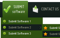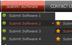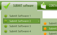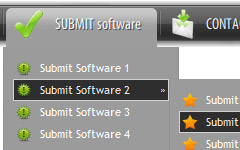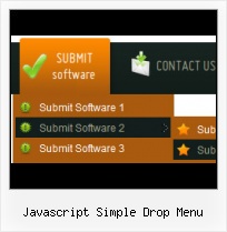
Text-based menu
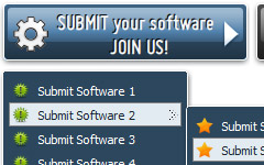
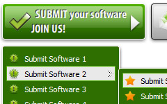
You can create a menu with text-based top items. Such menu will be loaded more quickly on your website (in comparison with image-based navigation).
Menu structure is comprised of HTML nested UL and LI tags. Standards compliant menu structure is simple to customize and update.

Fully Customizable
Every button or menu parameter can be easily customized in Vista Buttons to fit your web site design and your needs. Create your very own html menus, as simple or as complex as you want!
Mac Undo Buttons
Overlap all Html Elements on the Page
Submenus drop down over all the objects of the page (select, flash, object, embed).
Menu Script Download
Css Drop Down Menus
Create drop down menus based on css using Vista Buttons. Make various styles for each submenu item adjusting css styles.
Home Button Web
Menu Template:
HTML Hover Buttons Grey Toolbars |  |  |  |  |
Javascript Simple Drop Menu
This menu is generated by Javascript Menu Builder.
Create your own menu now!

Javascript Simple Drop Menu Screenshots

Menu, Button, and Icon Collection
Javascript Menu Builder provides huge collection of 1400 web buttons, 6600 icons, 300 ready-made samples, so you'll create really nice looking menus and buttons with little or nodesign skills at all! Web 2.0, Mac, iPhone, Aqua buttons, Vista, XP, transparent, round, glossy, metallic, 3d, tab menus, drop down menus will be a breeze!Button and Icon Samples

How to Use Javascript Menu Builder Menu Generator
1) File menu
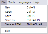
New - to create new project.
Open - to open saved project. You will be asked if you would like to save the current project in the menu buttons creator.
Save - to save current project in the project file (*.xwb). When you save to project file, the directory "ProjectName.xwb.icons" is created, where ProjectName is the name of your project file. This directory contains button icons, .css and .js files of the saved menu.
Save as… - to save current project in the project file (*.xwb) or in the HTML file or to save your project under another name. Choose type from the "File type" list in the "Save as…" dialog and enter project's (new) name. When you save to project file, the directory "ProjectName.xwb.icons" is created, where ProjectName is the name of your project file. This directory contains button icons, .css and .js files of the saved menu. If the menu doesn't have any icons then the directory is not created.
Save as HTML - to save current project into the HTML file (*.html). Project HTML file will be saved then, and the directory created, containing buttons' images. The directory name will be: "YourProjectName-files", where YourProjectName is the name of the HTML file saved. For example: if you enter "Header" in the "Name" field of the "Save as…" dialog, then "Header.html" and directory named "Header-files" will be created.
Exit - to close Vista Buttons application.
2) Tools
Export images - to save menu buttons' images as gif-files (*.gif), png-files (*.png) or jpg-files (*.jpg). "Save As…" dialog will appear, where you can either type each button name or leave it unchanged. If you want to save the button images, press "Save". "Save settings" dialog will appear where you can choose image format. Either way (if you don't want the button images to be saved), press "Cancel". This procedure will be repeated for all the menu buttons. When you press "Save", 1 to 3 images are to be saved, depending on the menu type. Their names will be: ButtonName_0.gif - ButtonName_2.gif, where ButtonName is the name you have entered when saving.
- ButtonName_0 - corresponds to Normal state.
- ButtonName_1 - Hot state image.
- ButtonName_2 - corresponds to pressed/clicked state.
Theme editor - to edit/create new themes.
Page insert - you can insert your menu into the existing HTML page.3) Languages menu

The "Languages" menu contains the list of available interface languages. English is the default language setting.
4) Help menu

Help - to read the help.
About -show information about Vista Buttons.- Double click on the one of the predefined buttons' and submenus templates to apply it to your menu When the submenu is larger than the visible area of the page the submenu will be automatically decreased. You can use scrollbar to see all submenu items Build menus completely based on Cascading Style Sheets. It is possible to appoint the individual CSS styles for separate elements of the menu.

Support
Please contact Customer Support at (please include template name in the message title)
FAQ
- "..The submenu of a menu buttons do not appear in front of a flash movie, it is allways under it. "
- "..Please provide step by step instructions on how to create and add a button for a buttons websites menu." Javascript Vertical Expandable Menu
- "..Can I set the pressed state of a javascript Vista Buttons after the page loads?"
- "..As soon as I mouseover an item, I get a broken image icon for my buttons Xp Html."
- ".. are you saying the button creater will be able to generate code that will enable my google editor to link into the images"
- "..I want the web page navigation bar in the top frame but the sub menus to appear in the bottom frame."


